
HTML = the skeleton and structure of a website (like the bones of a body). It determines where the heading goes, where the paragraph goes, where the buttons are, etc. CSS = the outfit, makeup, and styling of that website. It determines what color the heading should be, what the font should look like, how much spacing there should be, and how the page should appear on mobile, etc. With CSS you can:
-
Change colors (text color, background color, border color).
-
Set the size and type of the font. Adjust spacing (spacing between lines, between boxes and borders).
-
Specify the layout of elements (e.g., place a menu at the top of the page, an image on the left, and text next to it). You can create animations and visual effects (like buttons getting bigger when you hover over them).
-
Create animations and visual effects (like buttons getting bigger when you hover over them).
-
Make the page Responsive; meaning the site looks different on mobile, tablet, and computer and displays well.
Sass1 is a CSS preprocessor 2 that allows you to write CSS code much more professionally, cleanly, and quickly. Browsers cannot directly understand Sass files, so you write Sass code and then compile it into plain CSS. It also has built-in functions and inheritance. Autoprefixer is another tool in this area. After compiling Sass, it looks at the CSS output and automatically adds all the required vendor prefixes for different browser versions to the code.
CSS can be added to a site in three ways:
- inline (per tag)
- internal (in style tag)
- external (in .css file)
inline using the style attribute in HTML tags:
<a href="#" style="text-decoration: none;">click here</a>
The drawback of this method is that it clutters the site code and reduces readability. Its advantage is that Specificity3 بالاتری دارد.
<!DOCTYPE html>
<html lang="en">


<head>
    <meta charset="UTF-8">
    <meta name="viewport" content="width=device-width, initial-scale=1.0">
    <title>Document</title>
    <style>
        a {
            text-decoration: none;
        }
    </style>
</head>
<body>
    <a href="#">click here</a>
</body>
</html>
external, which is the most common method, by linking one or more CSS files to the HTML file in the head tag:
<link href="css/style.css" rel="stylesheet"/>
And in the MyStyles.css file located in the css folder, we insert the following code:
a {
    text-decoration: none;
}
The most important difference between the three methods is the weight and priority of the Style definition.
Pseudo-classes and pseudo-elements cannot be used in the inline method.
Selectors
To define the style and appearance of an element, we first need to select it:
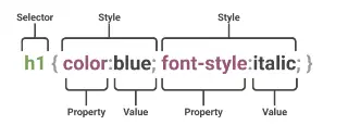
In the figure above, the h1 elements of the page are selected and the above properties are applied to them collectively.
After selecting, we must specify the property and assign it a Value. There are various ways to select the element or event of interest.
Simple
element Selector
The properties inside it are applied to all elements of the site:
p {
  text-align: center;
  color: red;
}
id Selector
The CSS ID selector selects an element based on its id attribute value. For the element to be selected, its id attribute must exactly match the value given in the selector.
#para1 {
  text-align: center;
  color: red;
}
ID must not contain spaces and must not start with a number.
class Selector
The properties inside it are applied to a class.
.center {
    text-align: center;
    color: red;
}
You can also select tags with a specific class as follows:
p.container {
    Color: black;
}
Attribute selector you can also select elements that have a specific attribute:
a[target="_blank"] {
    background-color: yellow;
}
This code will select hyperlinks that open in a new window. Also, if items like arrows have a specific meaning on the site, you can change their behavior for RTL layouts using the following property:
html[dir="rtl"] .arrow-back {
  transform: scaleX(-1); /* flips horizontally */
}
The following code will select elements whose title attribute contains the word flower:
<style>
    [title~="flower"] {
        border: 1px solid yellow;
    }
</style>

<a href="https://example.com" title="see flower details">
    View Documentation
</a>
The following code does the same for elements whose class word starts with top:
<style>
    [class|="top"] {
        background: yellow;
    }
</style>

<div class="top-sub lesson-item" style="background: yellow;">
    <span>📌 ۱.۱ - آشنایی با مفاهیم پایه</span>
</div>
If an element class is topcontent, it will not be selected and we need to use the following code to select it:
[class^="top"] {
  background: yellow;
}
The following code will select elements whose class name ends with test.
[class$="test"] {
  background: yellow;
}
The following code will select elements whose class name contains te anywhere.
[class*="te"] {
  background: yellow;
}
| Selector | Meaning | Example | Description |
|---|---|---|---|
| Exists | [title] | Elements that have the title attribute (any value) |
|
| = | Exactly equal | [type="text"] | Value exactly equal to |
| ~= | Contains word | [class~="btn"] | Value contains the word "btn" (space-separated) |
| = | Starts with value- | [class | |
| ^= | Starts with | [class^="top"] | Value starts with "top" (anything) |
| $= | Ends with | [href$=".pdf"] | Value ends with ".pdf" |
| *= | Contains | [class*="btn"] | Value contains "btn" anywhere |
| [attribute="value" i] | case-insensitive | [type="text" i] | Case-insensitive match |
One use of attribute selection is styling certain elements without creating additional names or identifiers for them:
input[type="text"] {
  width: 150px;
  display: block;
  margin-bottom: 10px;
  background-color: yellow;
}

input[type="button"] {
  width: 120px;
  margin-left: 35px;
  display: block;
}
Universal Selector
Selects all elements inside html.
* {
  text-align: center;
  color: blue;
}
Note
<style>
* {
    margin: 0;
}


#container {
    margin: 40px auto;
}
</style>
<div id="container">
Group selector
For selecting a group of elements and applying changes to all of them to make the code more concise
h1,h2,p {
    text-align: center;
    color: red;
}
Combinators1
It selects elements by analyzing the relationships between them.
In CSS, Combinators are symbols that define the relationship between two or more selectors.
Child2
The child combinator - usually displayed with a space character (" ") - combines two selectors so that elements matching the second selector are selected only if they have an ancestor (parent, grandparent, etc.) matching the first selector. Selectors that use a child combinator are called descendant selectors.
selector1 selector2 {
  /* property declarations */
}
For example:
<style>
    li {
        list-style-type: disc;
    }

    li li {
        list-style-type: circle;
    }
</style>
<div>
    <ul>
        <li>
            <div>Item 1</div>
            <ul>
                <li>Subitem A</li>
                <li>Subitem B</li>
            </ul>
        </li>
        <li>
            <div>Item 2</div>
            <ul>
                <li>Subitem A</li>
                <li>Subitem B</li>
            </ul>
        </li>
    </ul>
</div>
-
Item 1
- Subitem A
- Subitem B
-
Item 2
- Subitem A
- Subitem B
li selects all list items and sets their list-style to
disc.
The next selector selects all li elements that are nested inside another li and has higher specificity, setting their
list-style to circle.
Another example: you can customize default tags like img:
body img {
    height: 300px;
    width: 1000px;
    border-radius: 4px;
}
Direct Child3
The following code will select a tag that is nested inside another tag:
div>p {
    background-color: yellow;
}
Meaning: p tags that are inside a div. Assume our code structure is as follows:
<p>paragraph 1</p>
<div>
    <p>paragraph 2</p>
</div>
<p>paragraph 3</p>
<p>paragraph 4</p>
<div>
    <p>paragraph 5</p>
    <p>paragraph 6</p>
</div>
<p>tparagraph 7</p>
<p>tparagraph 8</p>
Then:
paragraph 1
paragraph 2
paragraph 3
paragraph 4
paragraph 5
paragraph 6
tparagraph 7
tparagraph 8
Paragraphs 2, 5 and 6 which are inside a div block will be selected.
Adjacent Sibling4
Or the sibling (+) combinator is placed between two selectors and, if all three conditions below are met, selects the second selector:
- The second element has matched
- The second element comes immediately after the first element
- Both are children of the same parent
/ The white space around the + combinator is optional but recommended. /
former_element + target_element { style properties }
For example:
div+p {
    background-color: yellow;
}
p tags that are immediately after a div will be selected. If our code is as follows:
<p>paragraph 1</p>
<div></div>
<p>paragraph 2</p>
<p>paragraph 3</p>
<div>
    <p>paragraph 4</p>
    <p>paragraph 5</p>
</div>
<p>tparagraph 6</p>
<p>tparagraph 7</p>
paragraph 1
paragraph 2
paragraph 3
paragraph 4
paragraph 5
tparagraph 6
tparagraph 7
div block.
Paragraph 4 is inside the div, not immediately after it.
Exercise:
<style>
    li:first-of-type+li {
        color: red;
        font-weight: bold;
    }
</style>
<div>
    <ul>
        <li>One</li>
        <li>Two!</li>
        <li>Three</li>
    </ul>
</div>
- One
- Two!
- Three
Selects li elements that are immediately after the first item of a list
Using the has function, you can simulate a previous sibling selector:
<style>
    li:has(+ li:last-of-type) {
        color: red;
        font-weight: bold;
    }
</style>
<ul>
    <li>One</li>
    <li>Two</li>
    <li>Three!</li>
    <li>Four</li>
</ul>
- One
- Two
- Three!
- Four
li element that is second to last in the list.
General Sibling 5
The general sibling combinator (~, a tilde) separates two selectors and matches all instances of the second element that come after the first element (not necessarily immediately) and share the same parent element.
/ The white space around the ~ combinator is optional but recommended. /
former_element ~ target_element { style properties }
Example:
<style>
    div~p {
        background-color: yellow;
    }
</style>
<div>
    <div>
        <p>paragraph 1</p>
        <p>paragraph 2</p>
        <main>
            <p>paragraph 3</p>
        </main>
        <div></div>
        <p>paragraph 4</p>
        <p>paragraph 5</p>
    </div>
</div>
paragraph 1
paragraph 2
paragraph 3
paragraph 4
paragraph 5
<p> elements that come after a <div> element and are at the same level (siblings) are selected.
Only paragraphs 4 and 5 come after a div and are at the same level.
Pseudo-classes
Pseudo-classes are used to describe a specific state of an element. For example, when the mouse hovers over an element or when it is clicked, etc. Pseudo-classes are classes that are applied to parts of one or more elements and are distinguished by the : symbol.
hover
Applied when the user hovers over an element with a pointing device like a mouse. For example:
<style>
    p:hover {
        background-color: yellow;
        color: #000;
        text-decoration: none;
    }
</style>
<p>Hover over me</p>
Hover over me
@media (hover: none){}
Pseudo-classes and classes can be combined:
<style>
    a.highlight:hover {
        color: #ff0000;
    }

    tr:hover td {
        background-color: lime;
    }

    table {
        border-collapse: collapse;
    }

    td,th {
        border: 1px solid black;
        text-align: center;
    }
</style>
<table>
    <thead>
        <tr>
            <th>Name</th>
            <th>City</th>
            <th>Age</th>
        </tr>
    </thead>
    <tbody>
        <tr tabindex="0">
            <td>Ali Mohammadi</td>
            <td>Tehran</td>
            <td>28</td>
        </tr>
        <tr tabindex="0">
            <td>Sara Hosseini</td>
            <td>Isfahan</td>
            <td>34</td>
        </tr>
        <tr tabindex="0">
            <td>Reza Karimi</td>
            <td>Shiraz</td>
            <td>22</td>
        </tr>
        <tr tabindex="0">
            <td>Maryam Ahmadi</td>
            <td>Mashhad</td>
            <td>41</td>
        </tr>
    </tbody>
</table>
| Name | City | Age |
|---|---|---|
| Ali Mohammadi | Tehran | 28 |
| Sara Hosseini | Isfahan | 34 |
| Reza Karimi | Shiraz | 22 |
| Maryam Ahmadi | Mashhad | 41 |
<style>
    nav ul li {
        display: inline;
        list-style: none;
        padding: 0;
        margin: 0;
    }

    nav ul li {
        position: relative;
        padding: 10px 15px;
    }

    li.has-dropdown:hover .dropdown {
        display: flex;
        flex-direction: column;
    }

    .dropdown {
        display: none;
        position: absolute;
        left: 0;
        background-color: white;
        border: 1px solid black;
        z-index:1;
    }

    .dropdown li {
        padding: 8px 15px;
    }
</style>

<nav>
    <div>
        <span>❤</span>
        <span>brand</span>
    </div>
    <ul>
        <li>Menu1</li>
        <li>Menu2</li>
        <li>Menu3</li>
        <li class="has-dropdown">Menu4
            <span>⌄</span>
            <ul class="dropdown">
                <li>Submenu1</li>
                <li>Submenu2</li>
                <li>Submenu3</li>
                <li>Submenu4</li>
            </ul>
        </li>
        <li>Menu5</li>
        <li>Menu6</li>
    </ul>
</nav>
link-visited
These apply to a and area elements that have an href attribute. link represents unvisited links and visited
represents
visited
links.
For privacy protection, styles that can be modified on links are restricted. Modern browsers
(Chrome,
Firefox,
Safari, etc.) have severely restricted styling of :visited to prevent hacking and identifying user browsing history.
For example, the background-color property cannot take any value. Sometimes attackers abuse CSSss
try to extract user browsing history.
/* unvisited link */
a:link {
  color: #FF0000;
}


/* visited link */
a:visited {
  color: #00FF00;
}


/* mouse over link */
a:hover {
  color: #FF00FF;
}


/* selected link */
a:active {
  color: #0000FF;
}
In the events domain, the pseudo-class link is for links that have not been clicked yet and the pseudo-class visited is for links that have been visited and active for the moment of clicking.
If hover is defined for a link, it will have higher priority than selectors related to link.
first-child
Shows the first child among a group of sibling elements.
p:first-child {
  color: blue;
}
The above code will select p elements that are the first child of other elements like html or div. Note that the p itself must be the first. For example, in the following code:
<style>
    div:first-child img {
        border: solid;
    }
</style>
<body>
    <div>
        <img src="./img1.jpg" alt="">
        <img src="./img2.jpg" alt="">
    </div>
    <div id="div2">
        <img src="./img3.jpg" alt="">
    </div>
</body>
img1 and img2 will be selected because #div2 is not the first sibling of its sibling. Or in the following code, paragraph 1 will not be selected because the first child of the parent is an h1, so none of the p elements are the first child of their parent.
<style>
p:first-child {
font-style: oblique;
}
</style>
<div class="container">
<h1>📝 آزمون سهسوالی</h1>
<p>paragraph 1</p>
<p>TEST</p>
<p>TEST</p>
</div>
In the following code, list item 1 will be selected:
<style>
    li:first-child {
        border: 2px solid orange;
    }
</style>
<ul>
    <li>list item 1</li>
    <li>list item 2</li>
    <li>list item 3</li>
</ul>
With the following code, the first i element in all p elements will be selected. You can also select pseudo-classes of specific elements:
p i:first-child {
  color: blue;
}
nth-child
Using the nth-child selector, you can specify specific selection criteria. For example, in tables you can distinguish odd and even rows to make the table more readable:
td:last-child {
    border-radius: 2px;
}

tr:nth-child(even) {
    background: gainsboro;
}
:nth-child() counts from the beginning, :nth-last-child() counts from the end. So
tr:nth-last-child(2)
meaning "second to last".
first-of-type
Shows the first element of its type (tag name) among a group of sibling elements.
<style>
    dd:first-of-type {
        border: 2px solid orange;
        width: 20%;
    }
</style>

<dl>
    <dt>Vegetables:</dt>
    <dd>1. Tomatoes</dd>
    <dd>2. Cucumbers</dd>
    <dd>3. Mushrooms</dd>
    <dt>Fruits:</dt>
    <dd>4. Apples</dd>
    <dd>5. Mangos</dd>
    <dd>6. Pears</dd>
    <dd>7. Oranges</dd>
</dl>
- Vegetables:
- 1. Tomatoes
- 2. Cucumbers
- 3. Mushrooms
- Fruits:
- 4. Apples
- 5. Mangos
- 6. Pears
- 7. Oranges
required - optional
Using the required selector, you can select required fields and attach properties to them. In contrast, the optional selector also exists.
<style>
    input:optional {
        background-color: lightgreen;
    }

    input:required {
        background-color: pink;
        border-color: red;
    }

    .req {
        color: red;
    }
</style>

<form>
    <label for="name">Name: </label><br>
    <input id="name" name="name" type="text" /><br>

    <label for="email">Email: <span class="req">*</span></label><br>
    <input id="email" name="email" type="email" required /><br>

    <label for="country">Country: </label><br>
    <input id="country" name="country" type="text" />

    <p><span class="req">*</span> Required field</p>
</form>
valid - invalid
With valid you can select elements whose value is valid. For example, in the following figure the input type is email:
<style>
    input:valid {
        background-color: lawngreen;
    }

    input:invalid {
        background-color: khaki;
    }
</style>
<form>
    <label for="email">Email: </label><br>
    <input id="email" name="email" type="email" value="test@example.com" />
    <p>Input a number between 1 and 10: <input type="number" min="1" max="10" value="10"></p>
</form>
If you try to enter values with invalid format in the above form, the border color will change.
root
We have another pseudo-class called root. This pseudo-class is used to apply rules to the base class, which in HTML is the html tag. One of its uses is declaring global variables:
:root {
  --main-color: hotpink;
  --pane-padding: 5px 42px;
}
has
The has pseudo-class checks for the existence of a condition:
nav>ul>li:has(> ul) {
    color: red;
}
The above code makes a ul that is inside another ul red. (Since color is inherited by children, all ul elements inside that ul will also be red)
If the input form has an invalid element:
form:has(input:invalid) {
    border: 2px solid red;
}
If the card has a picture:
.card:has(img) {
    padding: 1rem;
}
If the table has a selected row:
table:has(tr.selected) {
    box-shadow: 0 0 10px #999;
}
last-of-type
Shows the last element of its type (tag name) among a group of sibling elements.
Pseudo-elements
Used for styling a specific part of elements.
p::first-line {
    color: #ff0000;
    font-variant: small-caps;
}
The above code will select the first line of p elements.
p::first-letter {
    color: #ff0000;
    font-size: xx-large;
}
The above code also selects the first letter of p elements. You can also apply the selection to a specific class:
p.intro::first-letter {
    color: #ff0000;
    font-size: 200%;
}
first-letter only works for block-level elements.
Using the following code, you can add an item before a specific element:
p::before {
    content: url('./img/ww.png');
    height: .5rem;
}
Using the following code, the same operation will be performed after the specified element.
p::after {
    content: url(smiley.gif);
}
Using the following pseudo-element, changes can be made to li:
::marker {
    color: red;
    font-size: 23px;
}
Markers are used in ordered and unordered lists. Also, through the following selection, changes can be applied to elements that the user has selected:
::selection {
    color: red;
    background: yellow;
}
Select some text on this page
This is a paragraph.
#samplediv15 p::first-letter {
    font-size: 200%;
    font-weight: bold;
    color: #8A2BE2;
}
My name is Donald.
My best friend is Mickey.
We live in Duckburg.
Using the placeholder Selector, you can select elements equipped with this attribute:
::placeholder {
    color: red;
    font-size: 1.2em;
    font-style: italic;
    opacity: 0.5;
}
The backdrop pseudo-element is a viewport-sized box that is immediately rendered behind any element displayed in the top layer. For example, using it you can style the background of a dialog:
::backdrop {
    background-color: rgb(0, 0, 0, .8);
}
Specificity or Priority 6
Meaning: the rule that determines which style overrides others when multiple selectors point to one element. This rule is called id, class, element:
| Example | id, class, element | Weight |
|---|---|---|
| p { } | 0, 0, 1 | 1 |
| .class { } | 0, 1, 0 | 10 |
| #id { } | 1, 0, 0 | 100 |
| div.class1.class2 { } | 0, 2, 1 | 21 |
| div#id.class { } | 1, 1, 1 | 111 |
| div.class { } | 0, 1, 1 | 11 |
| div p { } | 0, 0, 2 | 2 |
Additional tips on specificity:
| Selector Type | Weight | Example |
|---|---|---|
| !important | ∞ (Infinity) | color: red !important; |
| Inline Style | 1000 | style="color: red;" |
| ID | 100 | #header |
| Class, pseudo-class, attribute | 10 | .btn, :hover, [type="text"] |
| Element (tag) | 1 | div, p, h1 |
| Universal Selector | 0 | * |
The higher the weight of a selector, the higher its priority. To control specificity more easily, instead of memorizing the above method, we follow a few simple techniques:
- Use
!important only when necessary (like utility classes in frameworks such as Bootstrap and Tailwind) - Use classes instead of ID
- Increase weight by repeating classes
.btn.btn.btn { background: red;}
- Use more specific attributes
[class="btn-primary"] {
    background: blue;
}
- Order in the CSS file. If weights are equal, the last one is applied: 7
p { color: red; }
p { color: blue; }
Exercise
Exercise 1:
<style>
    .foo p~span {
        color: blue;
    }

    .foo p~.foo span {
        color: green;
    }
</style>

<h1>Dream big</h1>
<span>And yet again this is a red span!</span>
<div class="foo">
    <p>Here is another paragraph.</p>
    <span>A blue span</span>
    <div class="foo">
        <span>A green span</span>
    </div>
</div>
Dream big
And yet again this is a red span!Here is another paragraph.
A blue spanMeaning of rule 1:
Any span that comes after a <p>, provided both are inside an element with class
.foo
.
Subsequent siblings, not necessarily immediately after, but anywhere after at the same level.
Meaning of rule 2: Any span inside an element with class .foo, and that .foo comes after
<p>, and all of these are inside a parent .foo.
1- First <span> (after h1)
Color: browser default
Reason: Not inside .foo, so none of the rules affect it.
2- <span>A blue span</span>
- This span is inside div.foo.
- It is at the same level after <p>.
- Rule 1 (.foo p~span) applies → blue.
- Rule 2? No, because it is not inside another .foo (it is inside a .foo, but it itself is not .foo).
3- <span>A green span</span> (inside nested div.foo)
This span is inside the inner div.foo. That inner div.foo comes after <p> at the parent level.
Rule 2 (.foo p~.foo span) applies → green.
Because: .foo has a parent, there is a <p> before the inner .foo, and we have a span
inside
that
.foo.
Rule 1? It also affects this span because it meets the .foo p~span condition (since it is again after
<p>
and
inside .foo).
But rule 2 has higher specificity because its selector is more precise (three classes/tags vs two) → green override.
Exercise 2 Let us write a verbal translation of the following selector:
#nav-toggle:checked~.navbar .nav-links {
  transform: translateY(0);
  opacity: 1;
}
"When an element with id nav-toggle is in the checked state, all elements with class nav-links that are inside elements with class navbar (whose subsequent siblings are checkboxes) should be styled."
The practical application of the above code is to toggle site menus to hamburger mode when the screen size is smaller than a certain value.
Colors
The <color> data type in CSS represents a color. A <color> may also
include
an alpha transparency value that indicates how the color should blend with its background.
Note
Although <color> values are precisely defined, their actual appearance may (sometimes significantly) differ from device to device. This is because most devices are not calibrated and some browsers do not support the color profiles of output devices.
There are several ways to specify the color of an element:
- By name
- By a hexadecimal number
- Functions
- sRGB
- RGB
- HSL
- HWB
- CIELAB
- lab
- lch
- Oklab
- oklch
- oklab
- Hex
- RGBa
- HSLa
- device-cmyk
- light-dark
- sRGB
- Relative
- color-function
- color
- from
/* Named colors */
rebeccapurple
aliceblue

/* RGB Hexadecimal */
#f09
#ff0099

/* RGB (Red, Green, Blue) */
rgb(255 0 153)
rgb(255 0 153 / 80%)

/* HSL (Hue, Saturation, Lightness) */
hsl(150 30% 60%)
hsl(150 30% 60% / 80%)

/* HWB (Hue, Whiteness, Blackness) */
hwb(12 50% 0%)
hwb(194 0% 0% / 0.5)

/* Lab (Lightness, A-axis, B-axis) */
lab(50% 40 59.5)
lab(50% 40 59.5 / 0.5)

/* LCH (Lightness, Chroma, Hue) */
lch(52.2% 72.2 50)
lch(52.2% 72.2 50 / 0.5)

/* Oklab (Lightness, A-axis, B-axis) */
oklab(59% 0.1 0.1)
oklab(59% 0.1 0.1 / 0.5)

/* OkLCh (Lightness, Chroma, Hue) */
oklch(60% 0.15 50)
oklch(60% 0.15 50 / 0.5)

/* Relative CSS colors */
/* HSL hue change */
hsl(from red 240deg s l)
/* HWB alpha channel change */
hwb(from green h w b / 0.5)
/* LCH lightness change */
lch(from blue calc(l + 20) c h)

/* light-dark */
light-dark(white, black)
light-dark(rgb(255 255 255), rgb(0 0 0))
The currentColor keyword represents the color property value of an element. This allows you to use the color value on properties that do not receive it by default.
If currentColor is used as the color property value, it instead takes its own value from the inherited color property.
Initially, there were 16 color names in CSS, but more were added later.
Tip
<style>
    :root {
        --selectedcolor: currentColor;
        --selectedInfo: "";

    }

    #colorPreview {
        height: 100px;
        border: 1px solid black;
        background-color: var(--selectedcolor);
        color: contrast-color(var(--selectedcolor));
    }


    #colorPreview::after {
        display: block;
        text-align: center;
        padding-top: 40px;
        content: var(--selectedInfo);
    }
</style>
<div id="colorPreview"></div>
<select id="colors" onchange="updateBox(this)">
    <option value="#000000">Black</option>
    <option value="#C0C0C0">Silver</option>
    <option value="#808080">Gray</option>
    <option value="#FFFFFF">White</option>
    <option value="#800000">Maroon</option>
    <option value="#FF0000">Red</option>
</select>


<script>
    function updateBox(select) {
        let htmlTag = document.documentElement;

        let colorName = select.options[select.selectedIndex].text;
        let colorCode = select.value;

        htmlTag.style.setProperty(
            '--selectedcolor',
            colorCode
        );

        htmlTag.style.setProperty(
            '--selectedInfo',
            `"${colorName} - ${colorCode}"`
        );
    }
    const select = document.getElementById('colors');
    updateBox(select);
</script>
In HEX notation, if all 6 characters are the same, you can write just three of them.
And the following color code is the same color with lower opacity, and the background behind the object will be partially visible:
#0000ff80
The last two digits are a number between 0 and ff, or 255.
Since the equivalent color for blue is the following code:
rgb(0, 0, 255)
We could have used the following code instead of the color code to achieve it:
rgba(0, 0, 255, 0.5)
Alpha determines the visibility of the background color of the element:
نکته
<style>
    #container {
        display: flex;
        width: 100vw;
        height: 100vh;
        background-image: repeating-linear-gradient(45deg,
                white,
                white 24px,
                black 25px,
                black 50px);
    }

    .item {
        flex: 1;
        margin: 20px;
    }

    :root {
        --base-color: purple;
        --standard-opacity: 0.75;
    }

    #one {
        background-color: var(--base-color);
    }

    #two {
        background-color: hwb(from var(--base-color) h w b / var(--standard-opacity));
    }
</style>
<div id="container">
    <div class="item" id="one"></div>
    <div class="item" id="two"></div>
</div>